23 Company Logos with Really Cool (or Strange) Hidden Messages

Warning: These logos are really fun and totally addicting. Ever since I started researching this article, I’ve been looking at every logo I can find to see if they have a secret meaning hidden within. Some are more obvious than others, but all are really fun to check out.
Amazon.com
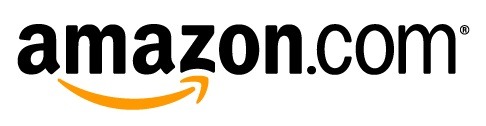
I always looked at the Amazon logo and saw a happy smile and nothing else, but I clearly wasn’t looking hard enough.
The smiley face is actually an arrow going from the A to the Z, signifying that they have every product under the sun from Aardvark Hot Sauce to Zumba Fitness DVD.
Apple
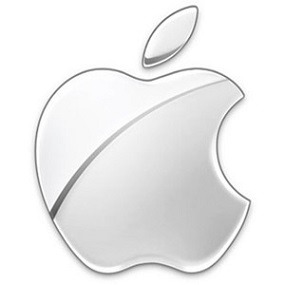
The apple with the single bite taken from it sure beats Apple’s first logo which resembles a flyer for a local Renaissance fair.
While this iconic logo doesn’t have any overt hidden meaning, many think the single bite from the apple is to honor Alan Turing, the man who laid the groundwork for the modern computer and unlocked German codes during WWII. He tragically ended his own life in 1954 after biting into an apple laced with cyanide.
Baskin Robbins
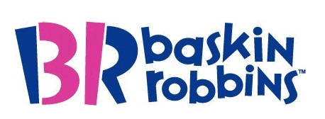
When I was a kid, we called our local Baskin Robbins ice cream shop “31 Flavors” because, well, that’s what they carried.
Their logo these days hints back to the good ol’ days which is really cool. Check out the B and the R and notice the “31” sandwiched in there to make up the letters.
F1 Racing
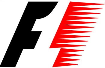
Formula One racing has a logo that uses white space in a unique way.
Notice the black F and the red racing streamers, then notice the white number 1 built off the F and red streamers. Kind of cool.
See Also: The Alternative Brands That Are Cheaper (and Often Just as Good)
FedEx
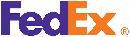
I’ve been looking at the FedEx logo for years, and never noticed the white arrow that makes up the “E” and the “x” in the word “Ex”. The arrow obviously signifies moving packages in the right direction and not being thrown by drivers.
George Washington University
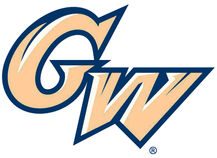
First of all, to understand this college sports logo you need to know that George Washington University is located in our nation’s capital.
Can you spot a national landmark located in Washington D.C. on the logo? Need help? Check out the “W” really closely. If you still can’t find it, look at the center of the “W”, do you see the Washington Monument? Looks more like the Leaning Tower of Pisa, but it’s definitely there.
Gillette
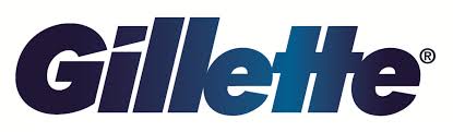
This one is a little more nuisance and has to do with the product Gillette is known for, razors!
Check out the “G” and the “i”, in particular the dot on the “i” and notice how it looks like a razor’s edge that cuts right through the “G” at the same angle. See it?
Goodwill
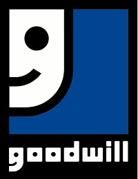
See the half smiley face in the top left corner of the Goodwill logo? Kinda hard to miss. Now look at the letter “g” in the work goodwill.
See any similarities? The smiley face obviously symbolizes the idea of maintaining goodwill and helping those that need it the most.
Hershey’s Kisses
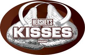
This is one of my favorites, both to eat by the dozen and logo investigate. See if you can find the single Hershey’s Kiss hidden in the word “KISSES”.
If you can’t find it, try turning your head 90 degrees to the left. Do you see it now, or did I just totally tweak your neck?
Jack In The Box
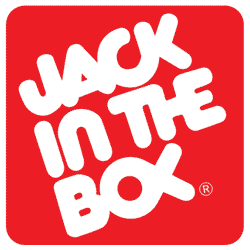
The old logo from Jack In The Box is a bit of a head scratcher. Check out the “o” and the “x” in the word “Box”.
They are mutated together to look like a fish. I can’t find any info as to why, maybe they had a new fish sandwich they were trying to promote at the time.
LG Electronics
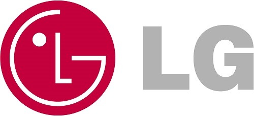
First off, any idea what LG stands for? Apparently it stands for “Life’s Good” which is okay, I guess. My life’s good, or at least better, when my electronics work like there suppose to. But look at the weird reddish circle thing.
First, do you see the L and the G? Next, do you see the face? The L makes up the nose and and the G is the face. Also, it kinda looks like PacMan ran into a city bus going 55.
Milwaukee Brewers
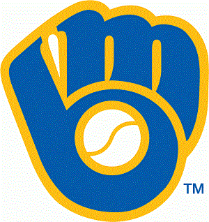
I can remember being a kid in the 80’s and finally seeing the double meaning of the Brewers logo.
I say “finally” because I apparently was a slow child, as I was the last of my friends to spot it. Do you see the “m” and the “b” that obviously stand for Milwaukee Brewers?
Okay, cool. Now do you also see that those two letters make up a baseball glove, along with an actual ball making up the center of the “b”. Whoever designed this logo clearly deserves a plague in Cooperstown.
Northwest Airlines
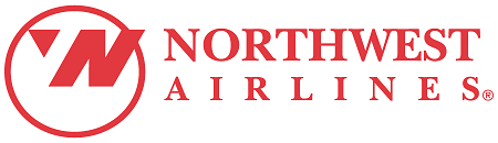
Northwest Airlines did a cool little thing with their logo. First, they combined the N and the W by using a negative space trick.
Then they had the tip of the “W” designed to look like an arrow which makes the circle look like a compass. In other words, Northwest clearly knows which direction they are flying.
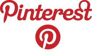
The name of the game at Pinterest is “pinning” cool things you find online to share with others.
So it makes sense they would get clever with their logo and add an actual pin to the “P”.
Pittsburgh Zoo
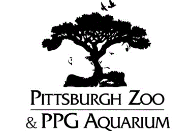
I love this one. The folks at the Pittsburgh Zoo do a fantastic job using negative space to create a memorable logo.
Can you spot the animals? I see a gorilla, a lioness, and a few fish at the bottom. This logo totally makes me want to take the kids.
San Diego Zoo

While not nearly as cool as the Pittsburgh Zoo logo, the San Diego Zoo kept to the animal theme and made the word “zoo” look like an animal paw print, or is it animal scat.
No, I’m sticking with paw print.
Sony Vaio
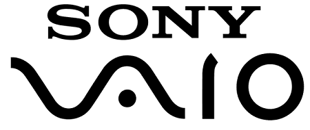
This one is really cool. When it comes to their VAIO logo, Sony was able to get creative and incorporate computers and technology directly into it.
The “VA” represents an analog wave and the “IO” represents the binary code of 1 and 0.
Starbucks
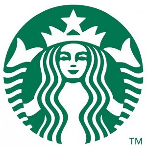
Have you ever wondered what the heck the mermaid looking thing was on your $4 Starbucks latte?
While nothing is hidden on the logo, it certainly has a significant meaning.
The gal is actually a 16th century Norse woodcut by the name of Siren.
She is a “twin tailed” mermaid and has strong ties to the sea. Starbucks being founded in Seattle, also has strong ties to the ocean and thus went with Siren back in 1971, and haven’t looked back.
Toblerone
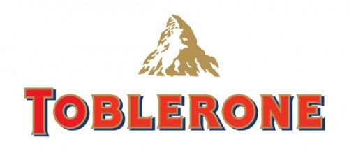
Do bears like chocolate? Apparently the folks at Toblerone think they do, as they hid a full silhouette of a bear climbing the Matterhorn on their logo.
Do you see it yet? In actuality, Toblerone is manufactured in Bern, Switzerland, a town known as the “City of Bears” located in the country famous for the Matterhorn.
Tostitos
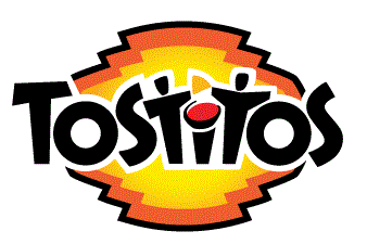
Check out the two “t’s” on both sides of the “i”.
The folks at Tostitos cleverly designed the logo to look like a couple chip enthusiasts fighting over a single chip, with a bowl of salsa, dotting the “i”, as the prize.
Tour de France
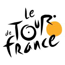
The Tour de France bicycle race created a cool logo a few years back that also has a dude riding a bike hidden in it.
Can you spot it? Take a look at the “r” in the word “Tour” if you need a hint. Notice both wheels and the rider? Looks like a steroid free Lance Armstrong.
Washington State University
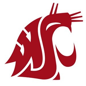
Washington State was able to make their school letters (WSU) actually look like their mascot, a cougar.
The “U” is a bit of a stretch and makes up the lower jaw of the cougar. But hey, definitely an A for effort.
Wendy’s
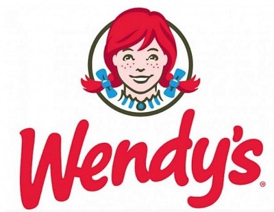
Nothing beats Mom’s home cooking like a juicy square burger from Wendy’s.
Check out the collar on Wendy’s shirt, do you see the word “MOM” hidden within? While Wendy’s has said the word is unintentional, I think it’s clearly a subliminal message.
Any logos out there that you think should be added to my list? Let me know and I’d love to take a look and get them added.
By Kyle James
I started Rather-Be-Shopping.com in 2000 and have become a consumer expert and advocate writing about out-of-the-box ways to save at stores like Amazon, Walmart, Target and Costco to name a few. I’ve been featured on FOX News, Good Morning America, and the NY Times talking about my savings tips. (Learn more)
I’ve seen a lot of these before but there are some new ones and some I’d forgotten about. Makes you wonder how much marketing is done to us that we never ‘see’.
Yep…or is it just of bunch of logo designers having some fun? Although my guess everything is done on purpose via a bunch of execs sitting around a conference table..
Fun post Kyle! Love the FedEx, as well as Goodwills. Very clever use of negative space.
Thanks Aaron, I especially like the Pittsburgh Zoo logo.